Your color palette plays a huge role in attracting your dream customer, so you want to make sure you choose your colors wisely. Color is one of the most important elements of your visual brand and will build a visual foundation. A carefully curated color palette can elevate your brand and create a unique and memorable experience for your audience.
Have you been wondering how to add color to your brand or how you can expand your color palette? You may have your 2-5 brand colors, but sometimes there are moments when you need to try something new. In this blog, we’re going to show you some easy ways you can add color to your brand while staying true to who you are.
We’ve broken down 3 easy ways you can add color to your brand plus one bonus tip on how to choose images for your brand.
But first, we have a freebie for you! If you want to save time making content (let’s be honest, we all do!) we’re giving you our guide “How to turn 1 piece of content into 12”. It’s a SUPER practical way of repurposing your content and it will definitely change the way you create content!! Click this link to get it today.
And now on how to add color to your brand…
01. Add color to your brand through shade
Having 2-5 brand colors may seem like a big number, but it can start to feel limited within time. With the amount of content that businesses produce these days, the last thing you want to feel is limited! Depending on what type of business you are and the volume of content you produce, you may need more brand color options. This is a fun trick to expand your brand colors while staying on brand. All you need to do is take your existing brand colors and create some shades from them.
Not sure how to do this? We’ll show you:
- In Canva, start with your primary five brand colors:

2. Take these colors and adjust the transparency 75%:
3. Repeat this step and adjust the transparency to 50%:
4. Repeat this step and adjust the transparency to 25%:
Now you have a range of new shades and extra colors that complement your brand while giving you more options to play around with!

02. Consider Environmental Color
When building out your brand colors, consider the environmental colors. What is your usual backdrop when you’re taking Instagram photos? Do your photos feature a lot of green nature in the background? Does it feature your bright pink office wall? Your environmental colors are those which frequently show up in your surroundings. Consider adding hints of these colors to your brand aesthetic to tie it into your color palette.
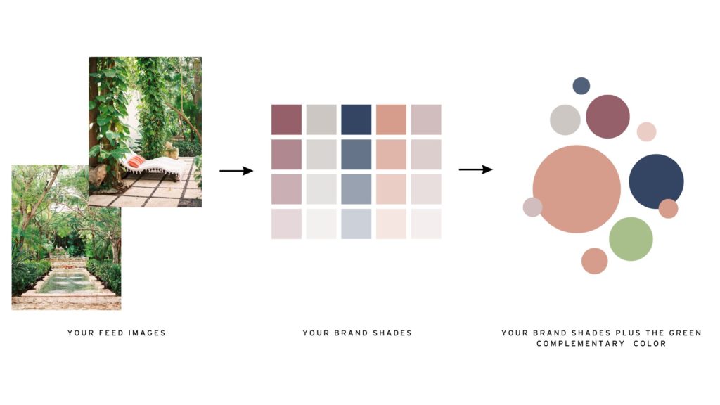
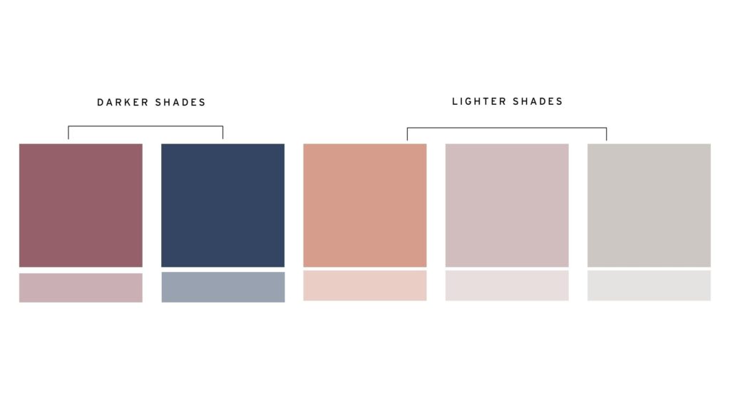
3. Have a Good Mix of Darker and Lighter Tones
We like to think about this step the same way we apply makeup. We don’t just use all one color. Most people add shades of color to their makeup. You’ve got the bronzer, the highlighter, the shades of eye shadow, and the foundational color. Your brand needs the same! To create depth and make your brand pop, your color palette needs a variety of light and dark colors.
SUMMARY OF HOW TO USE YOUR BRAND COLORS:
The last thing we want is for you to walk away from this blog and not remember anything! IF you don’t remember anything else, then remember this:
If your brand was a batch of cookies;
Your main 2-5 colors are the main ingredients of your brand— the flour, sugar, and eggs. Use these the most.
Your alternate shades and environmental colors are the ingredients you use sparingly-the baking powder, salt, or chocolate chips (unless you’re like us, we like extra chocolate chips).
Bonus point:
Consider the vibe you want your brand to portray!
An important part of choosing your brand colors is choosing brand images that are aligned with your color palette but also with your brand vibe! You want your brand images to reflect your brand personality. If your brand color is orange, not every orange color or orange image is going to represent your brand.
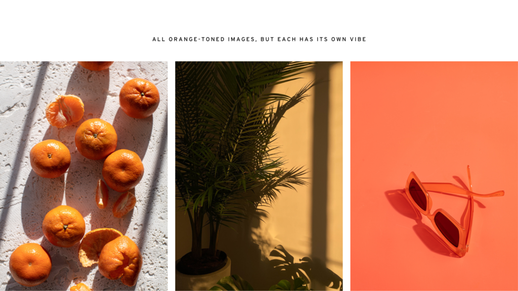
A fun way of choosing your brand vibe is to give your brand some keywords that you would use to describe your brand. Your brand keywords are going to be different than abstract items you may google to find imagery, such as “desk”, “flowers”, and “podcast mic”. Rather, you’ll want keywords that describe your brand’s feelings and emotions.
How do you want your audience to feel when they interact with your brand? Really consider what you want them to perceive and feel – and use these keywords to define your brand personality and vibe.
Gravitate towards the images that resonate with your brand keywords. Here are some fun examples:
QUIRKY | HAPPY | FRESH

FEMININE | NEUTRAL | RELAXED

QUIET CONFIDENCE | CALMING | TRUSTWORTHY

Now that you’ve got your color palette sorted, we’ve got you covered with beautiful brand images that will compliment your aesthetic.
Add color to your brand by using stunning imagery. Whether it’s soft neutrals, feminine pinks, or happy yellows, our exclusive gallery has it all for female entrepreneurs.
Our membership offers the curated images you need to increase brand recognition, earn trust, and achieve your digital marketing goals.
With Social Squares on your team, you’ll save time & money, show up more consistently, gain confidence online, and create content that matches the high-level product you already deliver.
Social Squares is the only styled stock photography membership that includes:
- A catalog of 6,000+ trend-forward, highly curated images, with new ones dropping every week.
- The best photographers in the industry contributing to your brand visuals for a fraction of what it would cost you to hire them for 1:1 services. (We’re talking hundreds and even thousands of dollars per shoot.)
- A robust keyword search engine so you can quickly locate exactly what you’re looking for. “Home office”, “yoga retreat”, “podcasting”–– we really do have it all.
- An algorithm that pulls images to suit your brand based on your color palette, industry, and interests
- Unlimited downloads. (Seriously, you can download as many photos as you need each month.) Plus caption prompts to make it even easier to click post.
Comments +
Comments —